Most logos are decorative. They are shapes chosen because they look professional, or letters arranged because they fit on a business card. They do not communicate anything beyond the company name — and that is fine, for most businesses.
But a translation company is different. What we do, at its core, is take meaning from one place and carry it — intact, accurate, and alive — somewhere else entirely. We thought our logo should do the same thing. Every element of the Metaphrase mark encodes something real about the work. This is the full story of how it was built, and why.
More Than a Mark
When we first began thinking about the Metaphrase brand identity, the temptation was to reach for the familiar visual vocabulary of language services: a globe, a speech bubble, two overlapping flags, a pen. These symbols are not wrong — but they are also not distinctive. They say "we work with languages" without saying anything about how or why.
We wanted a mark that would do something harder: encode the actual philosophy behind the work. Not just what the company does, but what it believes about the act of translation itself. That required starting not with shapes, but with ideas.
The word itself: "Metaphrase" comes from the Greek metaphrazein — to translate word for word, with precision and fidelity. It is the opposite of a loose paraphrase. The name was chosen deliberately: it signals exactness, not approximation.
What Metaphrase Is
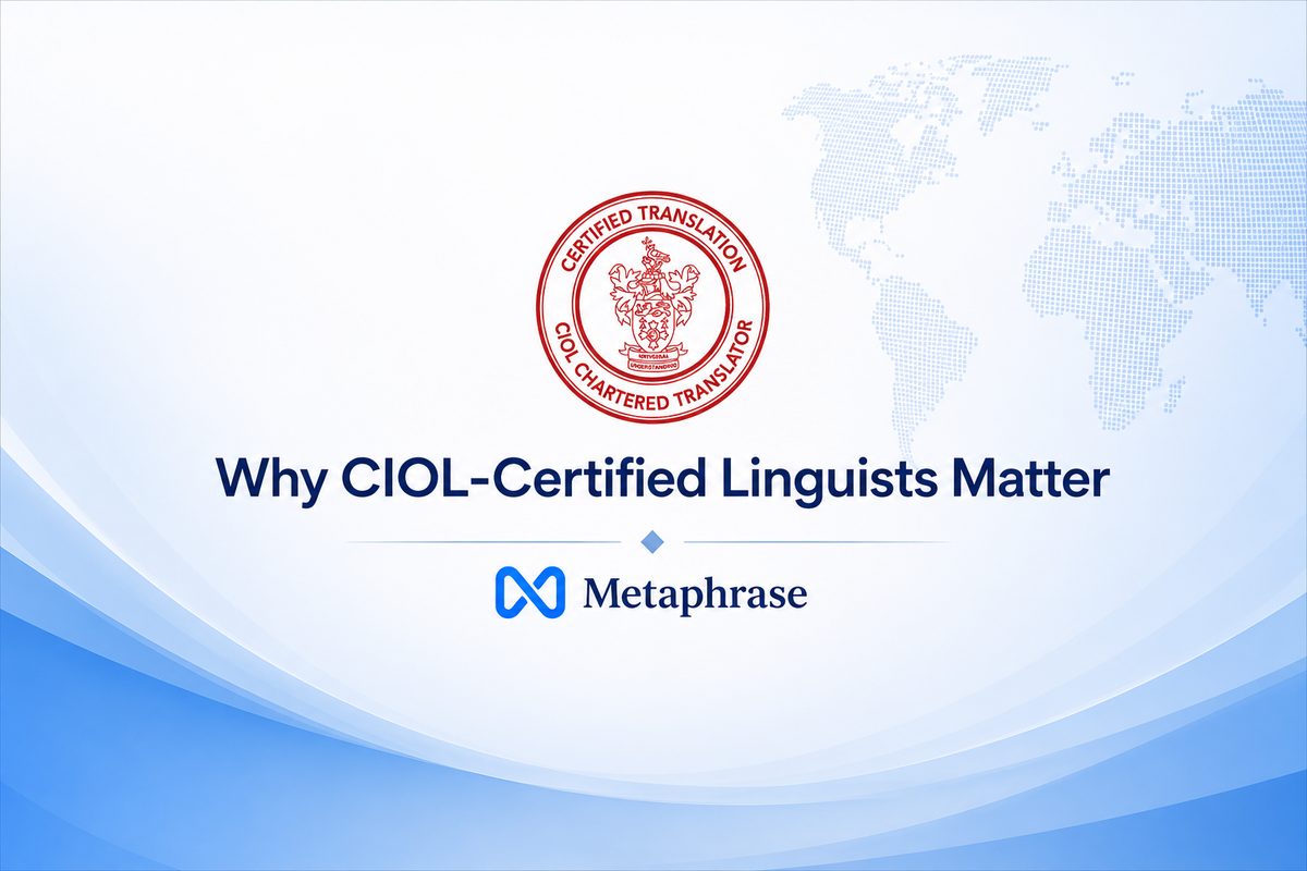
Metaphrase Ltd is a Certified translation, interpreting, and transcription company based in Birmingham, serving clients across the United Kingdom. We work with some of the most demanding clients in the country — the NHS, the Ministry of Justice, Crown Courts, the Home Office, and leading UK law firms.
These are not casual assignments. When a clinician needs to understand a patient's medical history from another country, or when a court needs a foreign-language document translated for criminal proceedings, there is no room for ambiguity or error. The standard we work to is not "good enough" — it is the highest professional benchmark recognised by UK institutions, backed by CIOL membership that can be verified by anyone, publicly, in seconds.
That context shaped everything about the brand. A logo that felt playful or generic would be wrong for the work. The mark needed to feel considered, precise, and trustworthy — because that is what every piece of work produced under it must be.
The Design Brief
Before any design work began, we defined what the logo needed to communicate:
- Professionalism: It had to signal that this is a credentialed, serious operation — not a freelancer with a website, but a company trusted by institutions.
- Meaning: It had to encode something true about what translation actually is, not just what industry it belongs to.
- Distinctiveness: It had to stand apart from the globe-and-speech-bubble clichés that fill the translation sector.
- Versatility: It had to work at any size — from a favicon on a phone screen to a printed letterhead — and in both colour and monochrome.
The answer we arrived at was to build the mark around three ideas that sit at the heart of all translation work. Not industry symbols, but universal concepts that anyone who has ever crossed a language barrier will recognise instinctively.
Looking for a Certified Translation?
CIOL-certified. Accepted by the Home Office, courts & UKVI. Fast turnaround.
Three Concepts, One Symbol
The Metaphrase mark is not a single idea — it is three ideas made inseparable. Each one reflects something fundamental about what translation is and how we approach it.
Meaning flows without interruption. Across languages, borders, and contexts — nothing is lost.
Languages connect people. Every word we translate bridges a gap between two worlds.
Translation is not replacement. It is a careful, respectful exchange — preserving intent, not just words.
Continuity — the flow of meaning
The first concept is continuity. When a document moves from one language to another, its meaning must not break. The thread of intent — the argument a solicitor has constructed, the diagnosis a doctor has written, the life story a refugee has described — must carry through entirely and without distortion. This is not metaphor. It is a professional and legal obligation.
The infinity loop, which contributed to the form of the mark, encodes this idea visually. A line that never breaks, never ends — it simply continues in a new direction. That is exactly what a well-executed translation does.
Communication — languages connect people
The second concept is communication. This might seem obvious for a language company, but the emphasis here is on the human dimension: not the act of converting words, but the act of connecting people who would otherwise be separated by language.
This is what motivates the work at a deeper level. A mother who cannot speak English and needs to understand her child's education. A witness who cannot give testimony without an interpreter. A patient who cannot communicate their symptoms. The mark carries that weight — the recognition that language access is not a convenience but a matter of justice.
Exchange — the bidirectional act of translation
The third concept is exchange. Translation is often talked about as a one-way process — source language to target language — but in reality it is dialogic. The translator moves constantly between both languages, testing one against the other, finding the equivalent that preserves not just the denotation but the register, tone, and cultural weight of the original.
The bidirectional arrow that feeds into the mark captures this. There is no hierarchy between the two languages — no original and no copy, only a careful, ongoing negotiation. That is what separates a professional translation from a machine output: the human back-and-forth of understanding.
Where the M Comes From
The three concepts — continuity, communication, exchange — were not placed side by side in the logo. They were fused into a single letterform: the M of Metaphrase.
The M was constructed so that its internal geometry reflects all three ideas simultaneously. The flowing curves echo the infinity loop of continuity. The open form at the top reads as two voices in dialogue — the twin peaks of the letter suggesting two parties in communication. And the central valley of the M, where the two sides meet, embodies the moment of exchange: the precise point where one language becomes another.
The result is a mark that does not merely decorate the name — it illustrates the work. Anyone who looks carefully at the Metaphrase M and knows what they are looking for will find the whole philosophy of the company inside a single letterform.
The Colour Language
Colour in professional services branding is not decorative — it carries connotation. The Metaphrase palette was chosen to reinforce what the work already communicates through its quality.
Deep navy is the dominant colour of the brand. Navy sits at the intersection of authority and trust. It is the colour of the Inns of Court, the NHS, and the professional institutions that our clients deal with every day. It says: this is serious work, handled by serious people. It does not shout — it does not need to.
The gradient within the M mark moves from deep navy through to a brighter, electric blue. This shift is intentional: it suggests both the depth of expertise the company draws on and the clarity with which it communicates. The darker tones speak to experience and rigour; the lighter tones to accessibility and directness.
Together, the palette positions Metaphrase where it belongs: not as a commodity service defined by low price, but as a premium, trusted professional partner — the kind of company a law firm, hospital, or government body would be comfortable placing their most sensitive work with.
On deliberate restraint: We considered introducing gold as a primary accent — it reads as premium and distinguished. We use it selectively in the brand system for precisely this reason: too much gold tips from distinguished into ostentatious. The mark itself stays within the navy-blue gradient, keeping it versatile and professional across all contexts.
The Tagline: Certified. Precise. Trusted.
Three words. Three full stops. No conjunction.
The tagline "Certified. Precise. Trusted." was chosen because it makes three factual claims — not aspirations, not marketing language, but things that are verifiably true. CIOL membership is publicly searchable. Our acceptance rate with courts, universities, and the Home Office is 100%. Our client recommendations number over 40, published publicly on LinkedIn, independently hosted, and written by solicitors, NHS clinicians, and government bodies.
Each word in the tagline was considered carefully:
- Certified — not self-declared, but formally accredited by the UK's most respected professional body for linguists. Anyone can call themselves a translator. CIOL membership is earned.
- Precise — the name Metaphrase itself means word-for-word accuracy. This is not a company that approximates. It is a company that delivers exactly what the document says, in the register and form the institution requires.
- Trusted — trust is the output of every preceding quality. It is also the thing that takes the longest to build and the least time to lose. Ten years of working with the NHS, the courts, and the Ministry of Justice has built something that cannot be replicated by a newer agency, no matter how competitive their pricing.
The three full stops are deliberate. They slow the reader down. They make each word stand independently, carry its own weight, mean its own thing. It is a typographic device that mirrors how a certified translator reads a document — one sentence, one clause, one precise meaning at a time.
What the Mark Stands For
A logo, in the end, is a promise. It is the thing a company puts on its work when it is saying: this came from us, and we are accountable for it. The Metaphrase mark carries that weight deliberately.
Every certified translation that leaves this company carries the mark. Every court assignment completed, every medical interpretation delivered, every visa document submitted — all of it goes out under the Metaphrase M. That means the three concepts encoded in that letterform are not just design philosophy. They are operational commitments.
Continuity: the meaning will carry through. Communication: the gap will be bridged. Exchange: the process will be done with the care and precision that the original deserves.
That is what the logo means. That is what we build every piece of work around. And it is why, when a client hands us a document that matters — a birth certificate for a visa application, a contract for an international acquisition, a witness statement for a criminal trial — we handle it not as a file, but as a responsibility.
Want to explore the mark in more detail? Visit our About page where the three elements of the Metaphrase logo are displayed interactively — hover over each concept to learn more.